

Healthcare is defined by moments of urgency, where every second and every piece of information matters for both patients and clinicians. In these high-stakes environments, digital tools must be intuitive, dependable, and clear to be functional. While user interface (UI) design is often associated with aesthetics, in healthcare it is also a critical component of patient safety.
A foundational element of effective UI is visual hierarchy: the intentional arrangement of on-screen elements to guide attention and action. In complex systems like electronic health records (EHRs) and clinical dashboards, a clear hierarchy ensures urgent information, such as a critical alert or medication conflict, stands out immediately. It reduces cognitive load, accelerates decision-making, and helps prevent errors.
In this article, we explore what visual hierarchy is, the cost of it being ineffective, and why it is so necessary specifically for the healthcare industry.
What is Visual Hierarchy?
Visual hierarchy prioritizes information so users can understand what to focus on first, second, and third. Its goal is not to make an interface more colorful or “pretty,” but to create clear, logical pathways through information. A lack of hierarchy is not a neutral design choice due to it forcing users to hunt for critical details that increases cognitive load and the risk of error.
We encounter hierarchy in everyday life. Newspapers highlight the most important story with the largest headline and prominent image, while secondary stories are smaller or placed in sidebars. Phones prioritize notifications: an incoming call dominates the screen, a text appears as a banner, and a social media like shows as a small icon.
On-screen, hierarchy is achieved through size, color, contrast, spacing, alignment, and placement. These tools guide users through information quickly and confidently, reducing their overwhelm and supporting faster and more accurate decision making.
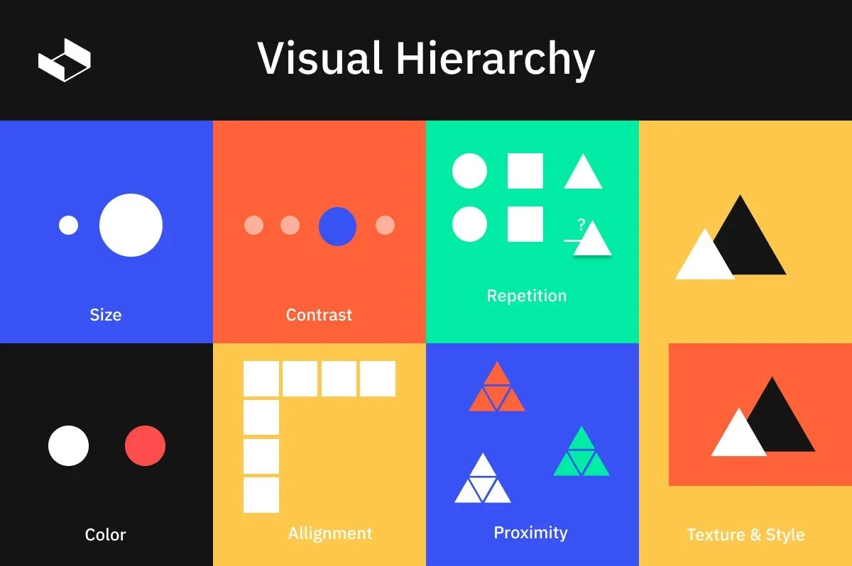
Photo credit: MaxCompose Graphic Designers Rely on Hierarchy
How Poor Visual Hierarchy Breaks Clinical Workflows
Consider the hereditary cancer lab report that had a flat visual hierarchy: minimal typographic scaling, uniform weights, and little spatial grouping. The variant classification, a critical outcome such as Pathogenic or Benign, appeared in the same size and weight as routine details and was buried in a paragraph. Actionable items, like identified mutations and recommended screening steps, were scattered across sections.
For clinicians, this design increased cognitive load and triggered “hunting” behavior instead of pattern recognition. In their fast-paced clinical settings, poor hierarchy slowly ate away at situational awareness and increased the risk of delayed or missed findings. Over a busy shift, this friction compounds, slowing decision-making and raising the likelihood of errors.
Designing Effective Visual Hierarchy
The hereditary cancer lab report was redesigned and is great use case for demonstrating how user-centered hierarchy can improve workflows The design team mapped the distinct needs of two primary users: General Practice Clinicans, who require a quick summary, and Genetic Counselors, who need detailed data. The solution was a two-tiered interactive hierarchy that separated these needs simplistically.
For GPs: The “Report Summary” view removed nonessential detail, highlighting variant classification, result interpretation, and next steps. Clear typography, a consistent color system, and grouped information blocks created instant focal points and scannable content.
For GCs: Interactive elements revealed deeper layers of information without crowding the layout. Increased white space defined informational boundaries and reduced cognitive load.
The result was a report that aligned naturally with clinical workflows: GPs could scan for critical findings in seconds, GCs could access detail efficiently, and a consistent visual language ensured essential information was always easy to find. This redesign showcases how visual hierarchy in healthcare UX is a practical tool for accuracy, speed, and patient safety.
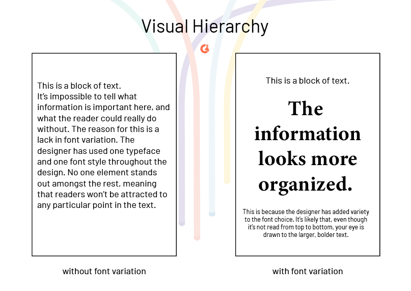
Photo credit: G2 Visual Hierarchy: Principles and Patterns
Validating Hierarchy in Healthcare Products
Effective hierarchy cannot rely on intuition alone. Whether you are a designer, developer, or part of a small team without dedicated UX resources, validation should be evidence-based.
Foundational Testing: Start with usability testing, heuristic reviews, or basic click-path analysis to identify early interaction issues.
Quantitative Measures: Track task completion time, errors, and attention patterns. Eye-tracking can add insight but is not required.
Contextual Validation: Test designs in realistic, high-pressure scenarios where cognitive load is high.
User Involvement: Engage clinicians, older adults, and people with disabilities early and often to uncover edge cases.
Continuous Feedback: Capture post-launch insights through lightweight channels such as in-product surveys or error monitoring.
The goal is to verify that hierarchy functions as a cognitive support system thus enabling users to access critical information quickly and accurately, even under stress. By approaching it this way, hierarchy becomes a practical and testable safety mechanism that any team can implement and refine.
How esolutionsONE Designs with Hierarchy in Mind
At esolutionsONE, visual hierarchy is embedded throughout our ONE|Deliver framework. During the Understand phase, the team maps workflows, user goals, and decision points to align designs with natural information priorities. Our Experience Consultants guide this process, ensuring a human-centered perspective.
In the Design & Architecture and Build phases, insights are translated into structured layouts, prioritized actions, and consistent visual cues. Each phase includes formal validation with clients, and user acceptance testing confirms that hierarchy supports actual task flows. Lessons are captured in Project Blueprints to inform future implementations, while ongoing support through vTEAMS allows hierarchy to evolve with client needs.
This structured approach ensures hierarchy is a tested tool that improves clarity, accelerates workflows, and strengthens usability across every ServiceNow solution we work on.
Prioritizing Visual Hierarchy in Healthcare
When building tools in healthcare, visual hierarchy must be looked at as more than a design principle. It is the tool you can use to guide attention, reduce cognitive load, and support effective decision-making. In the healthcare industry, where professionals must process complex information quickly and accurately, strong hierarchy is essential to an effective design. Poorly structured information can slow workflows, increase mental effort, and create opportunities for error, directly impacting patient outcomes. Conversely, a clear and consistent hierarchy allows users to scan results efficiently, identify critical findings at a glance, and act with confidence under pressure.
By prioritizing visual hierarchy in healthcare UX, teams can create systems that actively support safety, efficiency, and better care. In high-stakes environments, hierarchy must be at the forefront for effective human-centered healthcare design.